Optimizing Onboarding Journey:
Conversion rate increase for Nomo Banking App


- Company: Nomo Fintech
- Timeline: Dec 2023 - Mar 2024
- Collaboration: 1 Product Manager; 3 Developers; 1 UX researcher; 1 Copy writer
- My role: Product designer

What kind of journey are you on today? 

👉 Just browsing?

Only have 20 seconds?

See the quick highlights

☕ Feeling curious?

Got a coffee and want to dive in?

Explore the full story behind my design process
The old Nomo value proposition screen with 62% high drop off rate

Nomo Fintech is a UK-based, Sharia-compliant digital bank. Our challenge is a significant drop-off at the Value Proposition screen, where 62% of potential customers abandoned the onboarding process.

As a Product Designer, I collaborated with a cross-functional agile team working in a scrum framework, including developers, product managers, copy writer, and compliance team. Our efforts led to an 18.3% increase in conversion rates.

RESEARCH & BENCHMARKING

Dig deeper to understand why customers drop off

The first step is to understand the root cause behind the high drop-off rate. Collaborating closely with our user researchers, I set out to uncover the reasons why users discontinued to open an account at this critical stage.

🔎 Data analysis:  Using tools like Adjust, I mapped out the entire service experience and identified specific points where users were dissatisfied, focusing on the drop-off rates during the Value prop flow interaction.

Key findings:

  • The average conversion rate across the three countries (KSA, UAE, Kuwait) is 38.3% in the last 7 days
  • Only 8% customers consider the Nomo offerings are attractive

📐Competitive benchmarking: I benchmarked our Value prop screen against industry-leading banking apps (in UK & GCC* market). This comparative analysis helped us:

  • Identify best UX practices for presenting value propositions in a clear and engaging way
  • Understand the basic expectations of the customers

Key findings:

  • Most competitors grouped their benefits to reduce the cognitive load
  • The tone of the copy is more conversational instead of instructional
  • Comprehensive customer education at early stage of the journey (especially GCC market)

* The GCC (The Gulf Cooperation Council) is an alliance of six Arab countries—Bahrain, Kuwait, Oman, Qatar, Saudi Arabia, and the United Arab Emirates. These nations represent the primary target markets for Nomo Bank.

Check full Figjam board for benchmarking here

🗣️ Understanding customer needs:

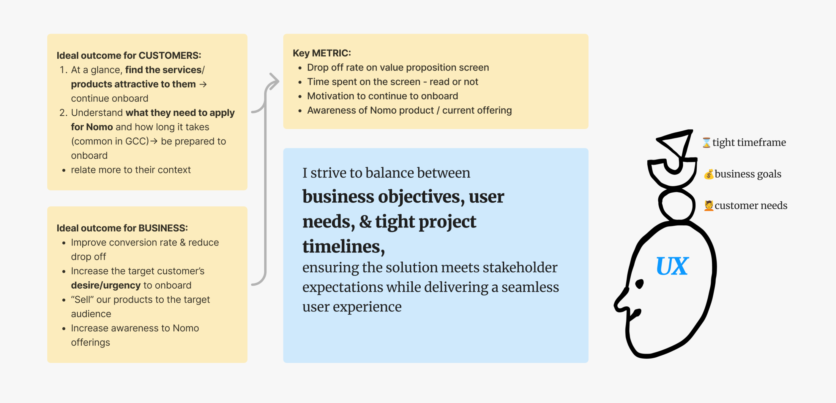
I aim to uncover the deeper motivations and expectations of our users. Through user interviews and surveys, the user researcher and I explored two key questions:

  • What offerings were users specifically looking for in our app?
  • And what initially attracted them to Nomo?

These insights helped us understand not only why users might be dropping off but also what value propositions were missing or unclear on the screen.

Key findings: 

Top 3 attractive features for our customers
DESIGN PHRASE 0: REVIEW & PLAN DISCOVERY

Manage the stakeholders’ expectations

To align with stakeholder goals, I worked hard to balance business objectives, PM timelines, and technical constraints from the start of design discovery.

Strive to balance between business goals, user needs and project timelines

In the sprint planning, I clearly outlined the requirements and make sure PM, tech, scrum masters, & senior leadership team all aligned with our goals and timelines.

💰 Business goals:

  • Primary: reduce the drop off rates and increase the overall conversion rates
  • Secondary: ensure new customers onboard smoothly and efficiently

⌛ PM requirements:

  • Design the screen to help new customers understand Nomo’s offerings quickly and clearly in order to onboard smoothly without confusion
  • Design discovery should be accomplished within 2 sprints, and ready for development by mid March

🚧 Technical limitations:

  • The onboarding requirements varied by country, for instance the minimum income requirements only for UAE market
  • Dev team emphasized the need to reuse existing design components to minimize development costs
DESIGN PHRASE 1: BRAINSTORM & IDEATIONS

Ideation workshop: how to engage the customers?

Rather than redesigning at the corner, I facilitated a workshop with the compliance team, user researcher, and PM to determine the most relevant information to include and how to present it in order to engage customers effectively.

Design rationale:

  • Use more visuals to capture the attention of the users
  • Group the benefits and add icons to reduce users’ mental load
  • Add the customer education screen to better prepare the customers for onboarding
Quick prototyping during the workshop
DESIGN PHRASE 2: FINALIZE CONCEPTS FOR UXR TESTING

User flow iterations for user testing

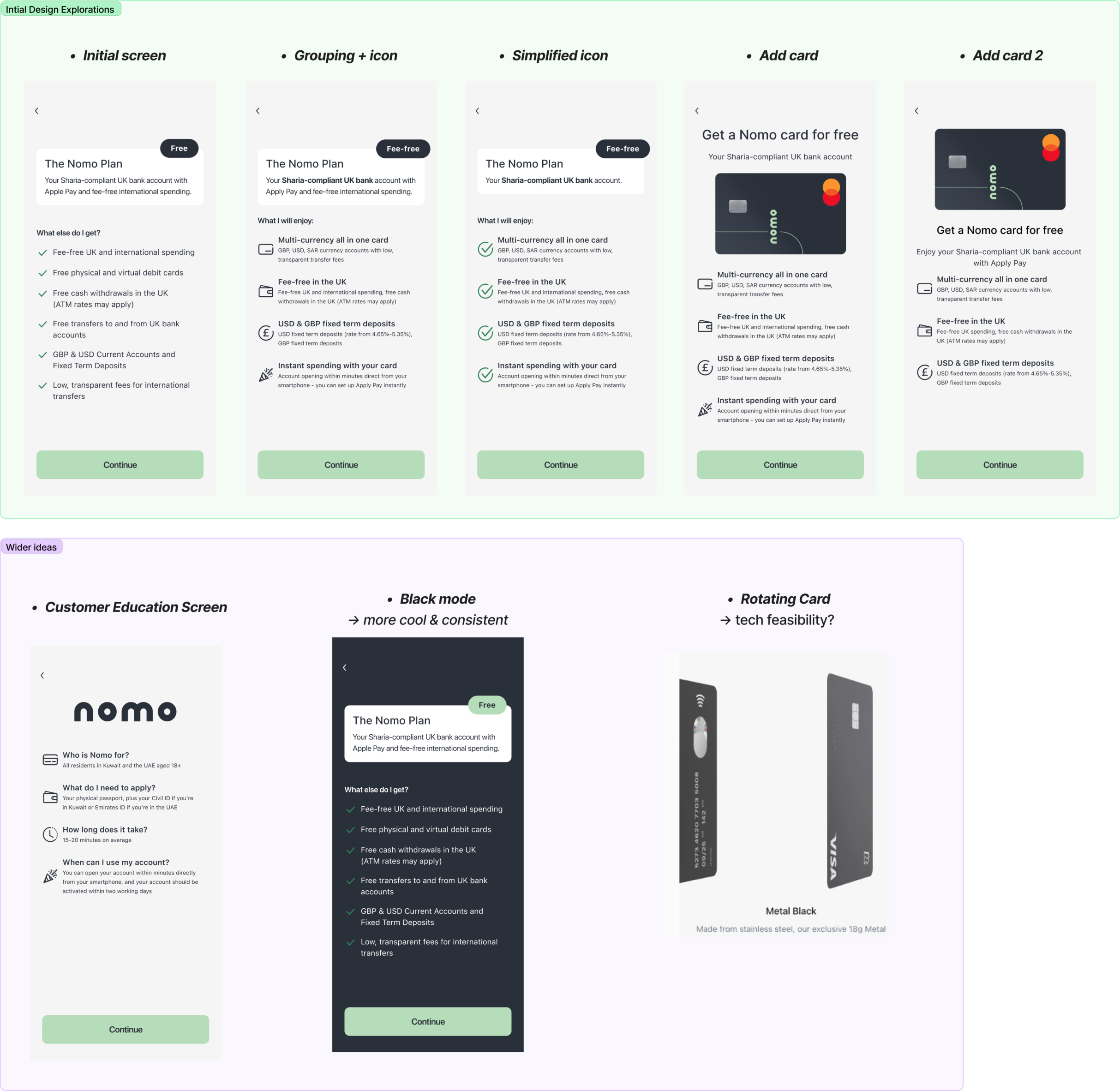
Following the workshop, I refined two design options favored by most stakeholders and iterated on them in collaboration with cross-functional team (copy writers, PM, compliance team, design system designer...). Also, I worked closely with developers to ensure the technical feasibility of the solution before moving forward with user testing.

​Iteration items:

  • Legal requirement: we need to be accurate about the account opening time, since it is illegal to trick the customers into onboarding by giving them the wrong time
  • Copy iteration: refine the title and descriptions to make it more instructive and concise
  • Technical restrictions: put the customer education screen after the country selector as we could not locate the customers
2 design options for user testing

However, at this point we faced resistance to user testing, as the Head of Product felt we were allocating too many resources and too much time for a single screen, viewing the testing as unnecessary. Thus he requested us to push for design solutions asap.

KEY CHALLENGE

Senior stakeholders thought we could design the screen quickly without iterations and saw user testing as unnecessary.

However, because we're targeting high-net-worth customers in three countries with different needs, testing was crucial to address their different needs. The challenge is balancing business requirement with user experience.

Conflict between user experience and business requirement
DESIGN PHRASE 3: Align with UXR to create plan & prototypes to validate designs

Find the Happy Middle Ground to Conduct User Testing

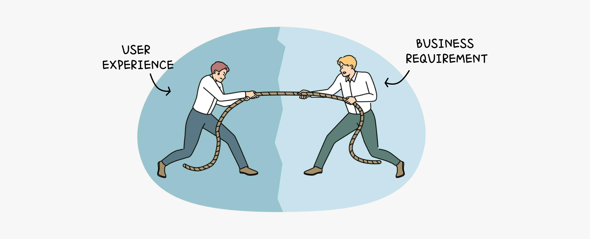
To address conflicts between user experience priorities and business requirements, I proactively engaged senior stakeholders, emphasizing the value and necessity of UX testing in aligning user needs with business objectives.

Recognizing the constraints of time and resources, I advocated for a strategic approach: focusing testing efforts on the most critical and "high-risk" areas of the user experience. This targeted approach ensured we prioritized improvements that would have the greatest impact on user satisfaction and business outcomes.

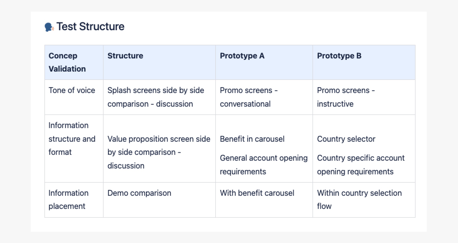
Collaborating closely with the UX research team, I helped design and implement an optimized testing structure, streamlining processes and enhancing the efficiency of insights collection.

FInal UX testing structure

However, at this point we faced resistance to user testing, as the Head of Product felt we were allocating too many resources and too much time for a single screen, viewing the testing as unnecessary. Thus he requested us to push for design solutions asap.

DESIGN PHRASE 4: Iterate based on UXR findings

Quick implementation of UXR findings

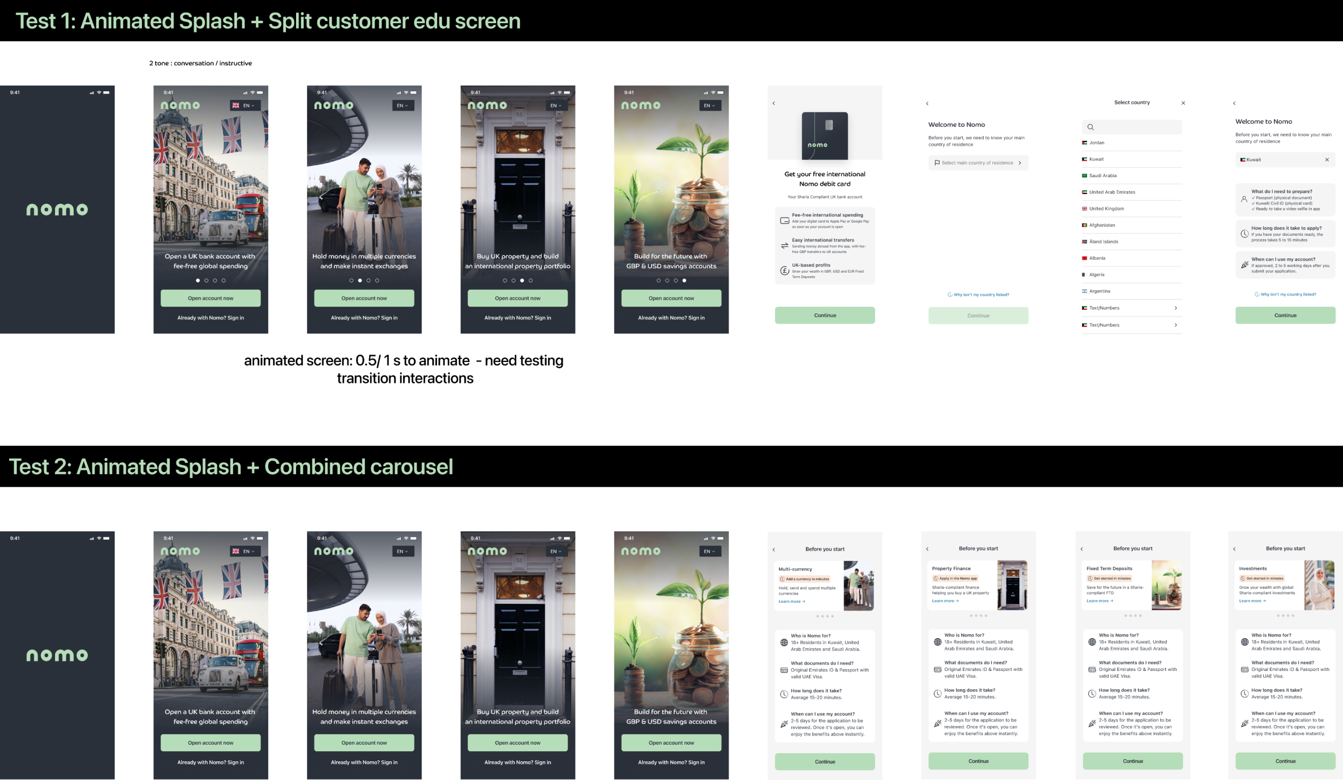
I rapidly iterated the user flow in response to insights gathered from user testing.

Key iterations:

  • Users expressed a lack of trust in Nomo -> I incorporated the FSCS protection scheme prominently within the journey, reinforcing the platform's credibility
  • Users still not sure why apply Nomo for -> I emphasized the unique value proposition, “Secure your wealth in the UK,” which differentiates Nomo from other GCC banks that do not offer this service
  • Animation pushes users to read more -> three customer education piece fade in one by one
Iterated user flow