This is what I thought when I started the design of this micro-interaction. However, it turns out to be a complex interaction that requires clear signifier and timely feedback for an intuitive and smooth user experience.
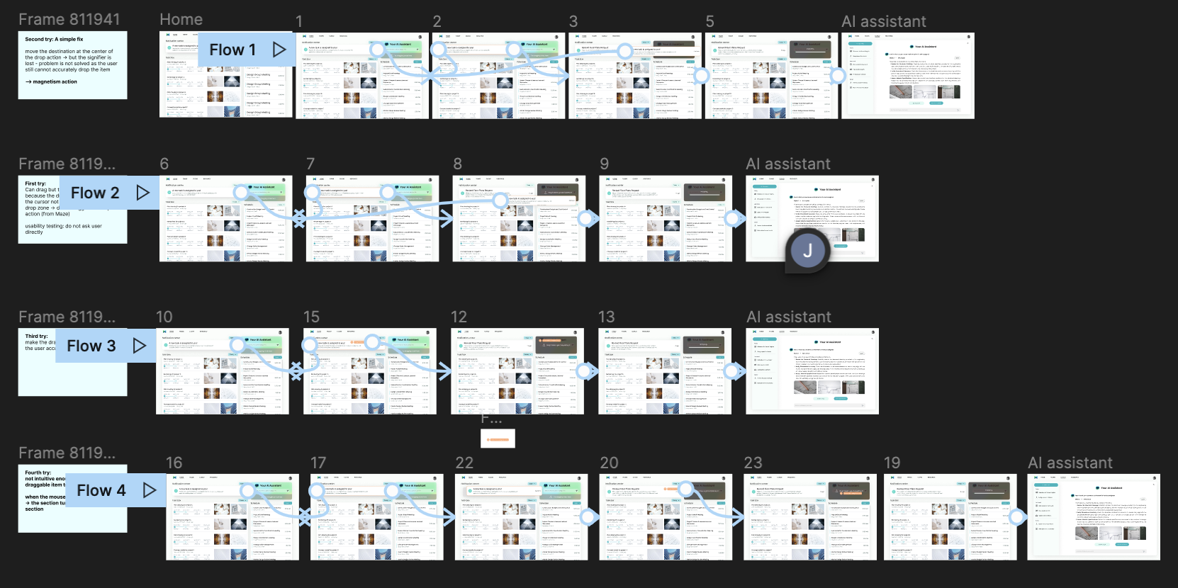
Let me quickly walk you through how I created this "Drag and Drop" interaction in Figma. Within 2 days, I iterated on the design 4 times based on insights gathered from remote usability testing conducted with Maze.

I started from reflecting on the past drag and drop actions I did, and then dissected the interaction into the following 4 steps:
Start small and build big! I started designing the smaller blocks, such as the focus state of draggable item and the analyzing states of the drop area.
By using the components I created and following the 4 steps, I was able to quickly prototype the interaction in Figma using the "On drag" action.

The first prototype looks quite promising! However, you can never know the problem without testing with users. Thus, I used Maze to put together a quick remote unmoderated testing of this interaction.
Here I did not mention the "drag and drop" action directly, and want to observe if users attempt to do drag and drop the notification.
Results: only 50% of users finished the task and the misclick rate is really high. 3/4 of users got away from the expected path and 3 testers got lost!
I was quite shocked at the result and tries to dig down into reasons.

I then discovered several usability problems by talking to the testers and observe their process of dragging:
Problem 1: The user is not aware of the exact position of the dragged area, thus the mouse ends up out of the drop area -> not triggering the drop action
Possible Solution: activate the drop zone once the user grab the item, and shows exact position
Problem 2: The dragged item (notification card) is too long, and the drop area is on the edge of the screen -> no accurate dropping, dragging too far and the mouse ends up out of the screen
Possible Solution: allow space for the inaccurate drop so that the users don't have to position the card precisely - magnetism on the drop zone
At this stage, I did not jumped right to fixing the existing issues, but took a step back to do small desktop research. I wanted to dive deeper into how mature softwares build this drag and drop interaction and what are the key elements.
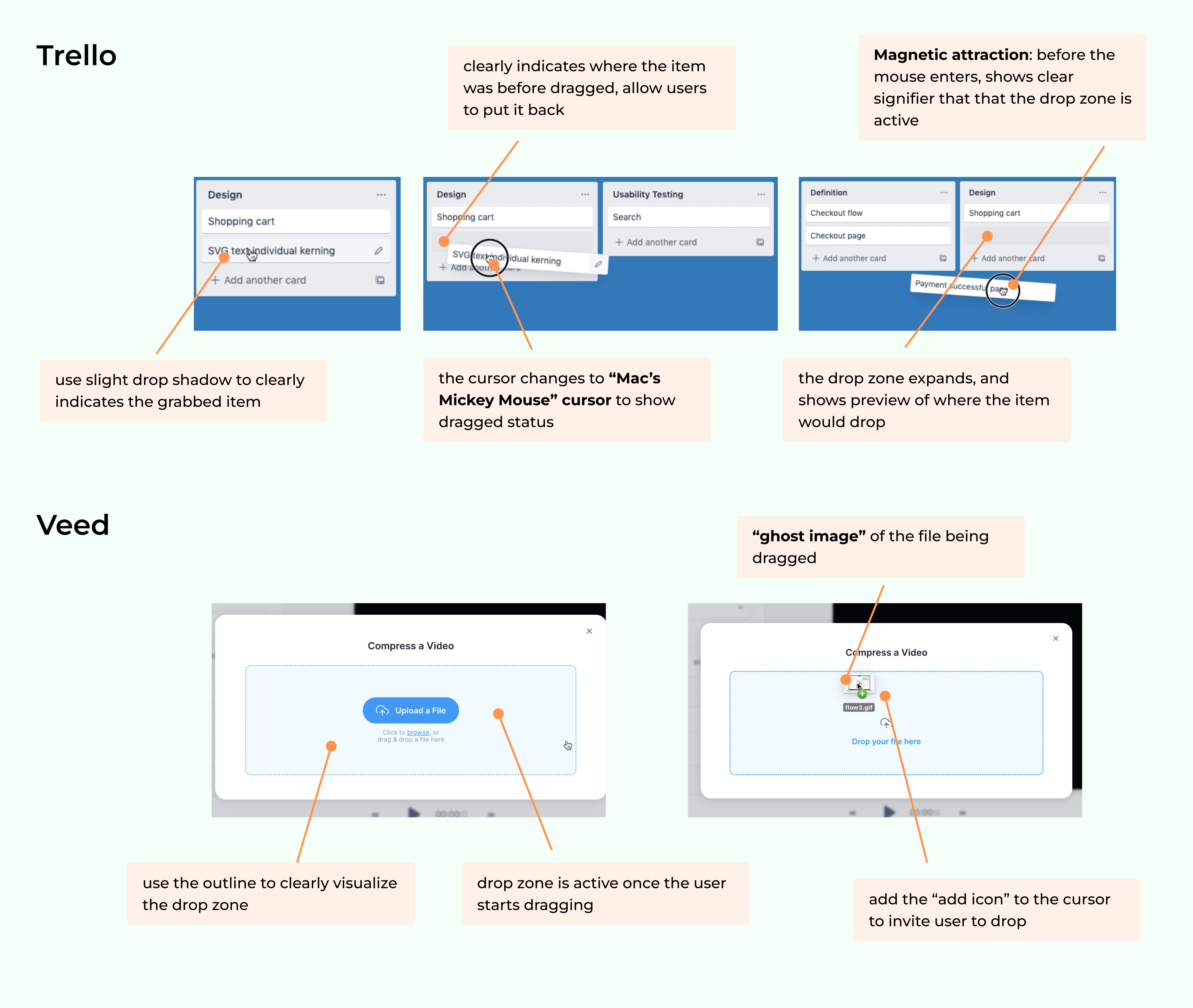
Based on the insights from good examples and usability testing, I start iterating on the interaction.


However, the dragging action still is not feeling intuitive, and the user cannot link the orange ghost icon with the dragged card.
So I did another improvement to make the dragged item turns into smaller "ghost card" when the mouse goes forward the drop zone to create the magnetic effect.