* The key interface images are blurred due to NDA (Non-disclosure agreements).
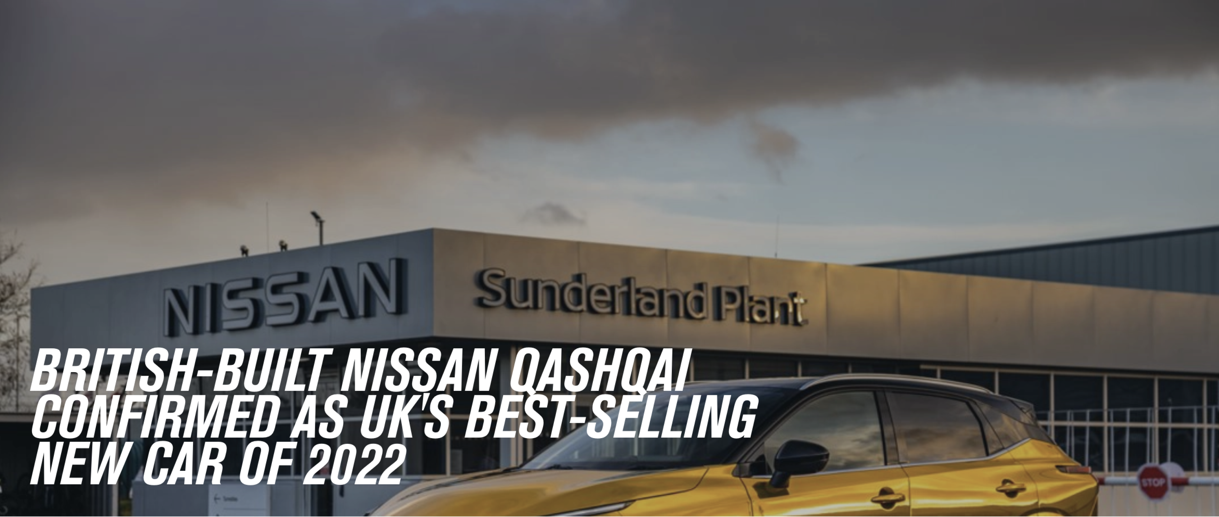
Nissan Qashqai, the top-selling car in the UK in 2022, boasts impressive sales figures that reflect its popularity among drivers in Europe. However, the Qashqai's in-car digital experience leaves much to be desired.
In a recent customer survey from marketing team, 71% of car owners, have expressed their dissatisfaction with the in-car system, 89% with a sense of disconnection in their user experience with the brand. Many people cite the lack of intuitive features and a mediocre user interface as major pain points.
To get the managers’ buy-in for the user research, I presented a compelling case that highlights the potential benefits and value of conducting user research, with the key objective to understand:
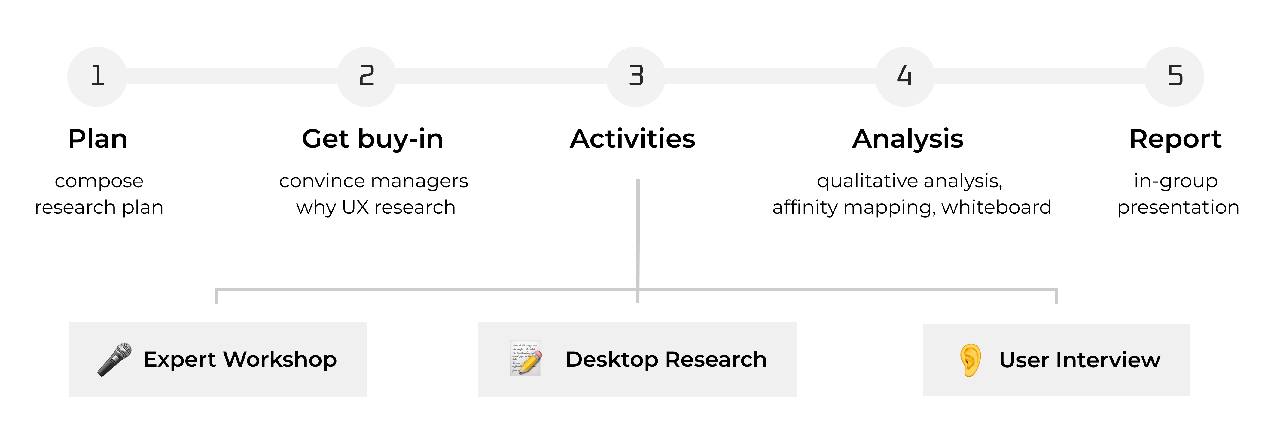
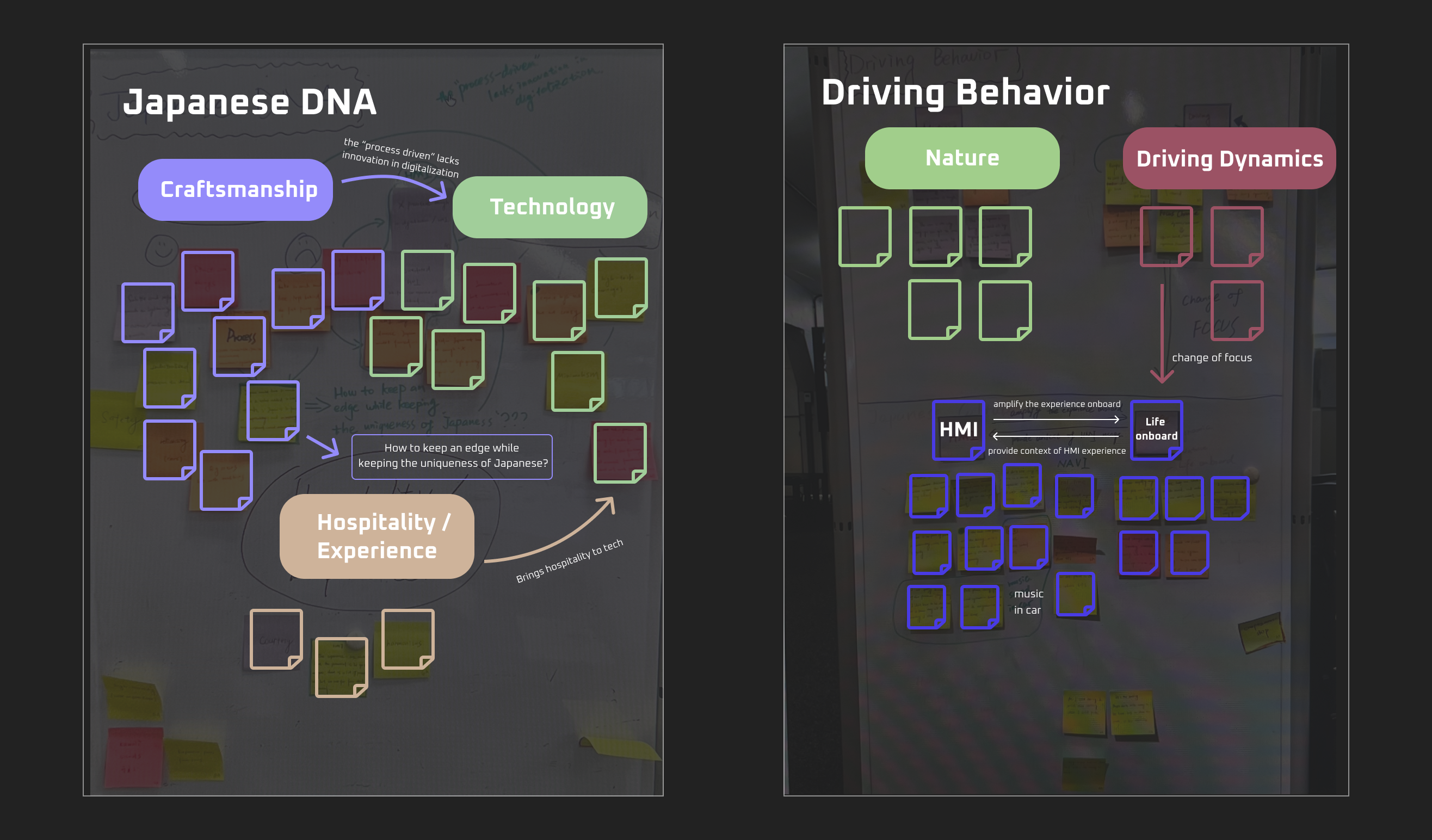
We held a 3-hour face-to-face workshop with Japanese culture experts, who provided us with 12 Japanese themes and values, also cultural factors which influence the design in Japan.
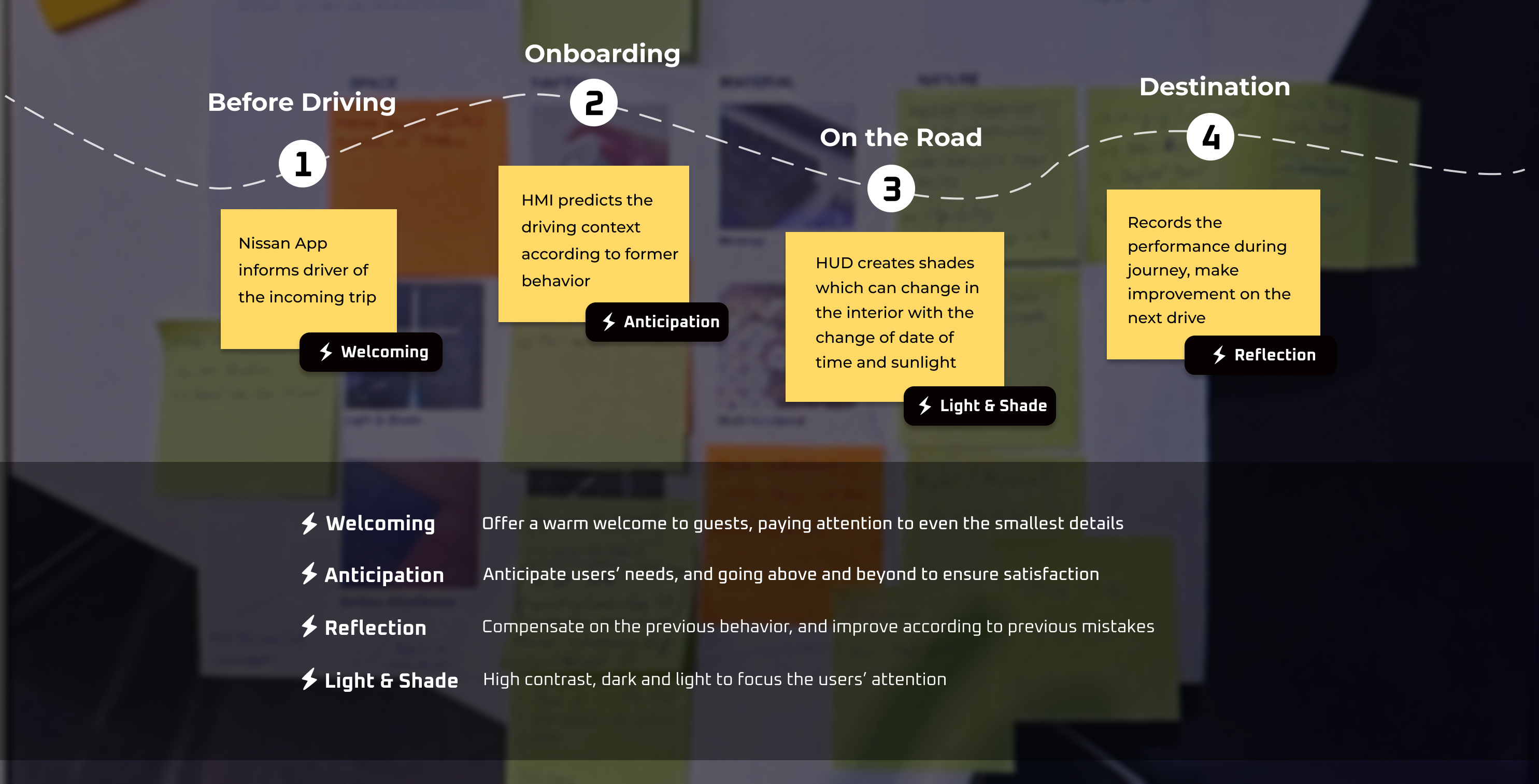
Using the Japanese focus on nature and intuitive interactivity, alongside other unique Japanese concepts, we re-created the user journey map with J-DNA.
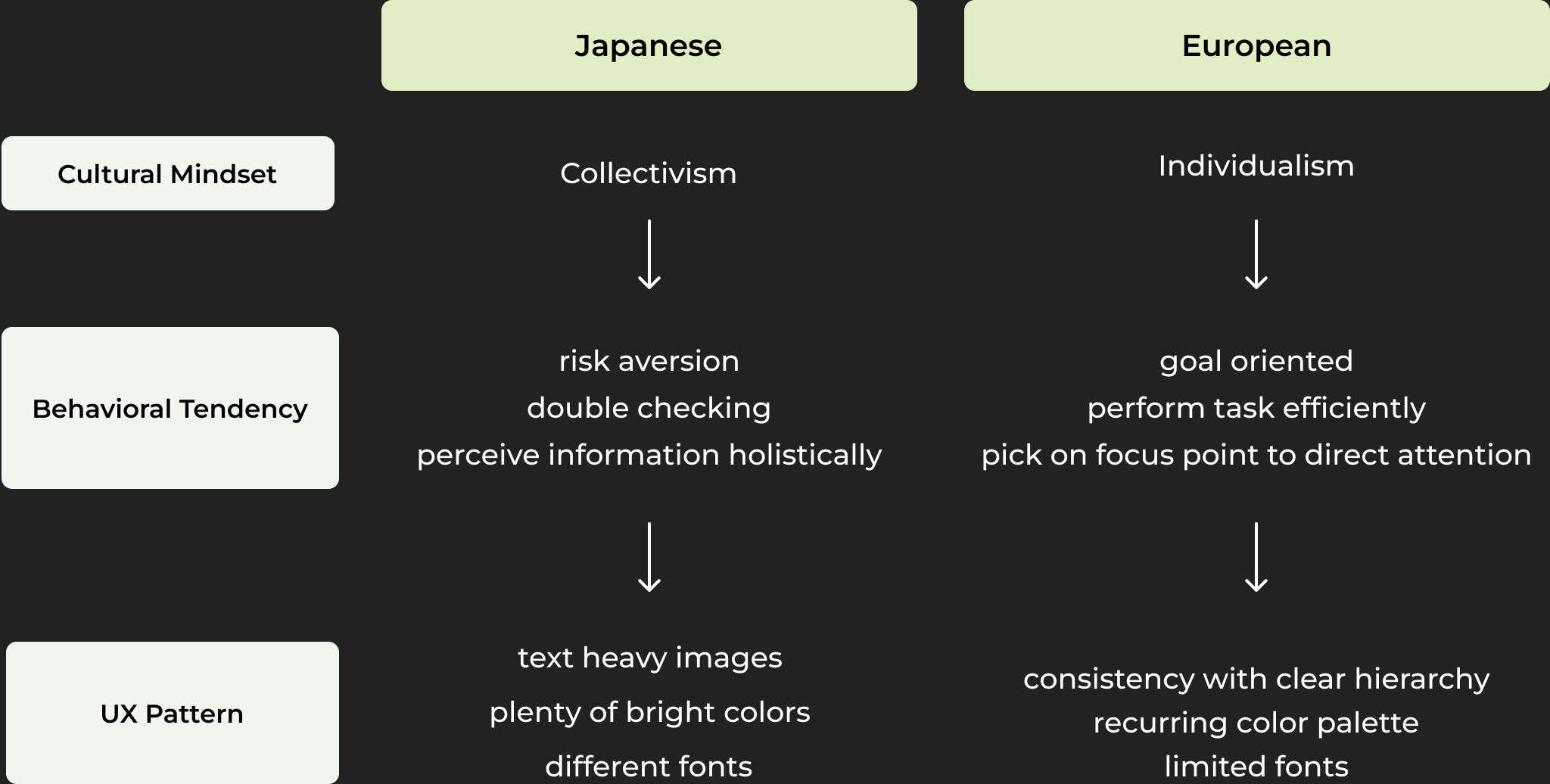
To bridge the gap between culture and user experience, I introduced Hofstede Culture Dimension. Hofstede’s theory provides a systematic framework to compare multiple cultures from 6 dimensions.
Based on the survey results coupling with the interview insights, I found why interface designed in Japan looks so busy from the point of the Europeans.
Based on the survey framed by Hofstede Culture Dimension, the power distance and uncertainty avoidance of Japan are significantly higher than that in Europe. This serves as the underlying cultural reason for the difference in UX.
From the previous research, we could quickly get the know the Japanese UI themes and concepts that could be directly incorporate into HMI.
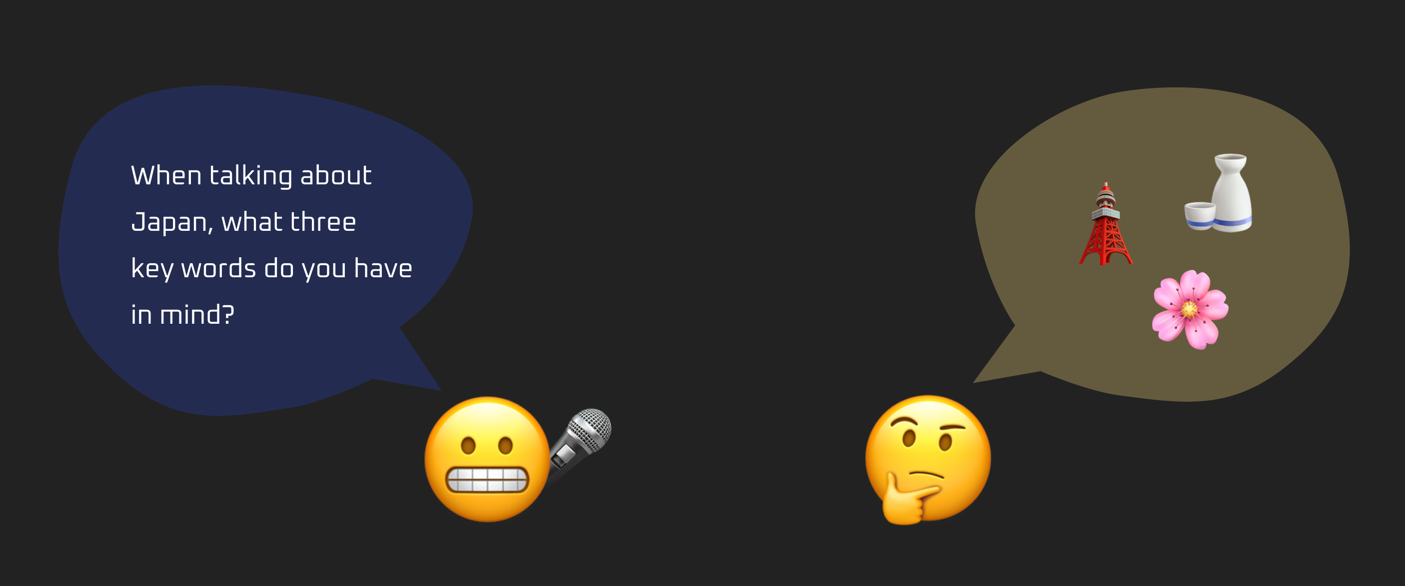
However, “Are these J-DNA concepts really what Europeans think of Japan or what we think they would?” To find out the real “Japan” in the mind of Europeans and understand the unique context of driving in Europe, I conducted 6 in-depth user interviews with people who have experience of driving in Europe.
To cluster the insights from the user interviews, I led the affinity mapping session with designers and product managers. We followed the certain procedures:
From affinity mapping, we gained a complete view of how Europeans think of Japan and unique driving experience in Europe.
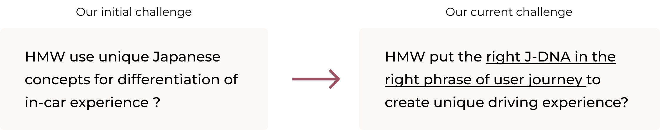
After analyzing the results of user research, the challenge we are facing is: overwhelmed by the number of Japanese themes and values, and could not find the right direction of design. Thus, our challenged has reframed:
To find the solution, I used a prioritization matrix to categorize our concepts. It plots each concept based on two weighted criteria: feasibility and brand value. Brand value means how much does this concept connects user to the uniqueness of Nissan brand.
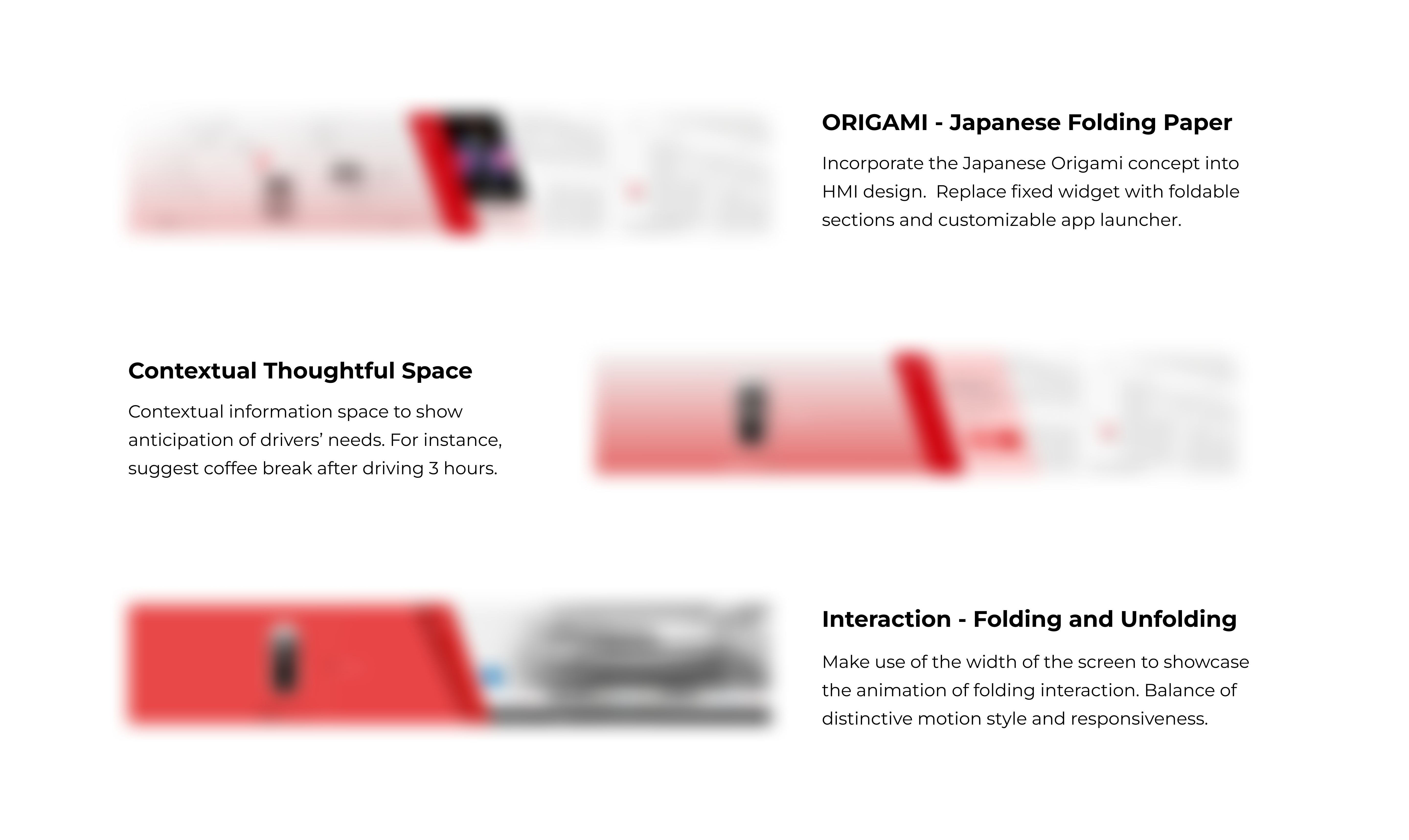
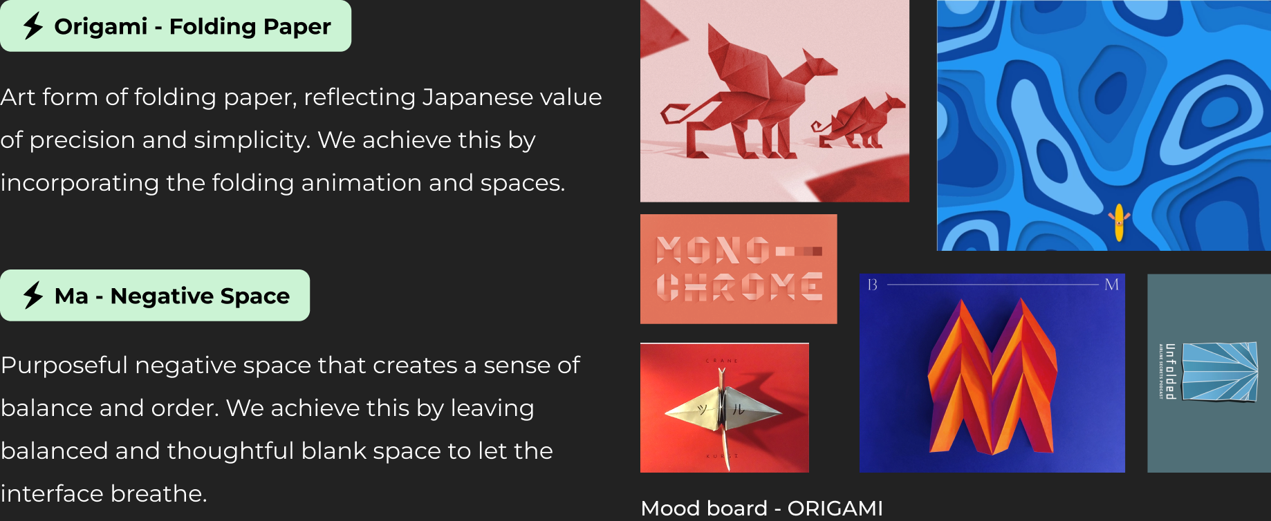
The ORIGAMI concept was placed on the top right of the graph due to its high brand value and feasibility.
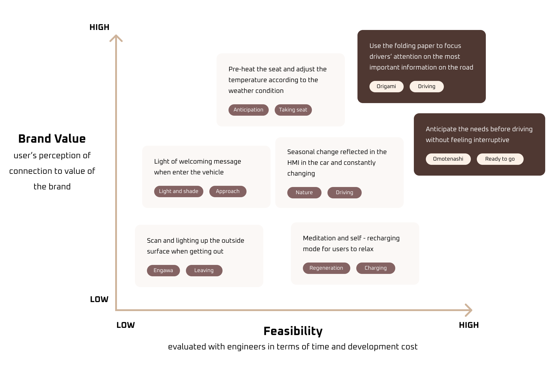
Based on the prioritization matrix, we were able to focus on the right J-DNA (origami) in the right phrase of user journey (during driving) to kickoff the design.
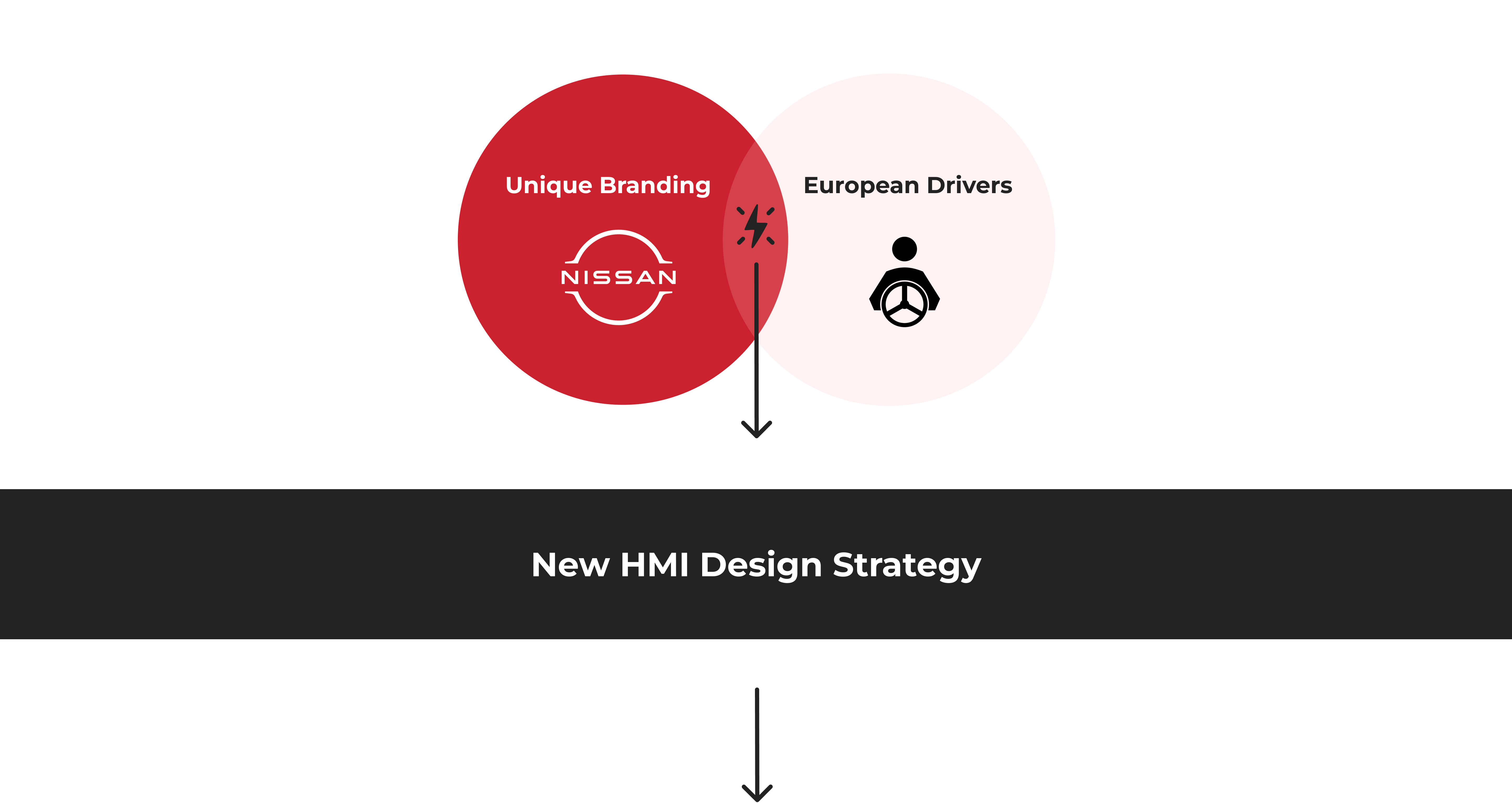
Before getting our hands dirty in Figma, I began by outlining the UX and UI strategy to ensure a cohesive and user-centered design approach that aligns with our goals of creating unique driving experiences in the context of driving in Europe.
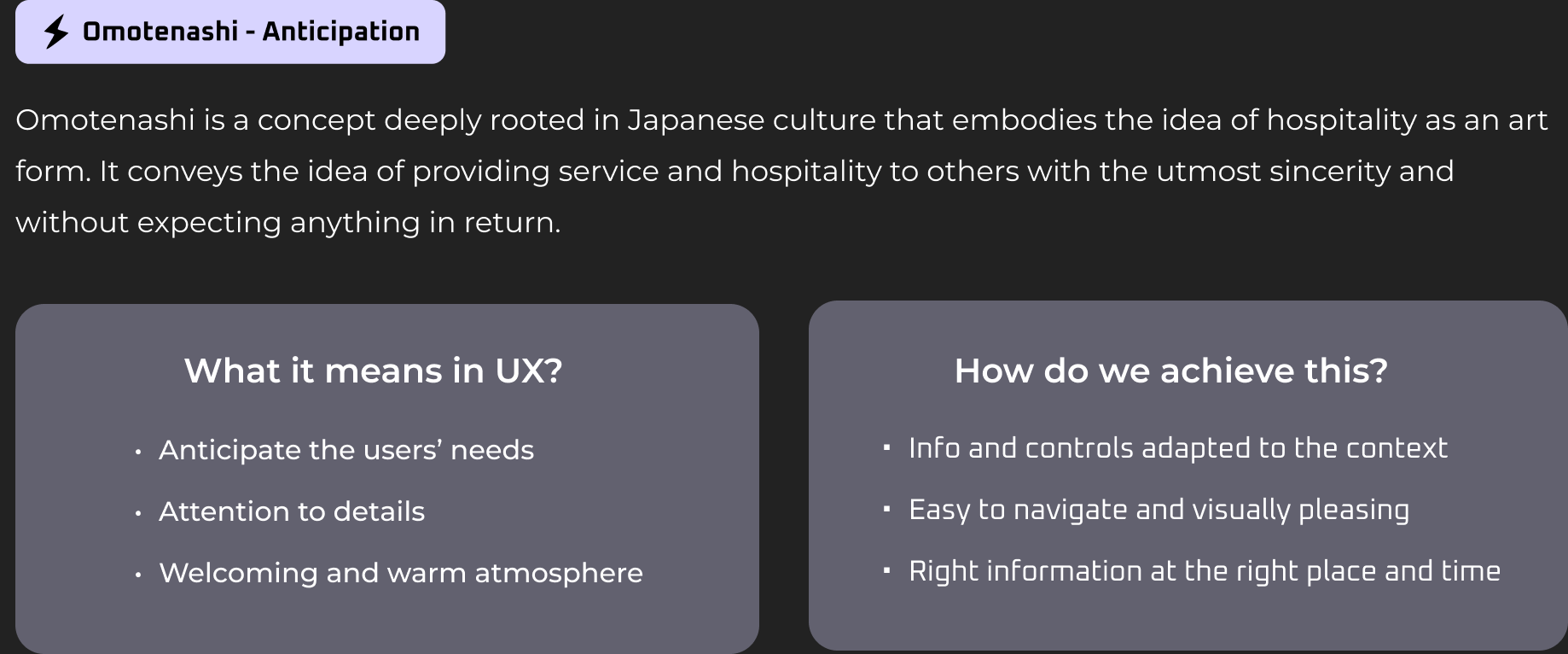
Create an up-to-date and hospitality experience that is rooted in both Japanese culture and Nissan-ness, as a way to visually differentiate at the same time being usable and familiar.
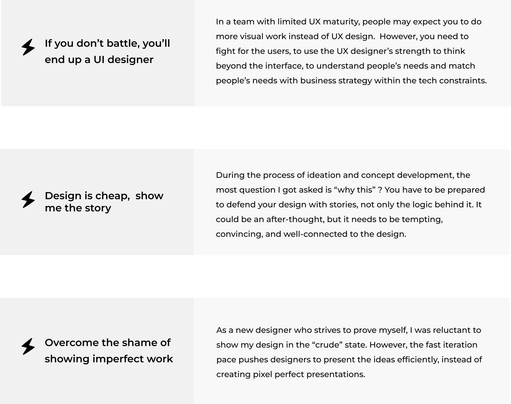
UX Design is not only about the look and feel, which is only the tip of the iceberg. Beneath the surface lies the foundation of a successful design: effective information architecture and engaging interaction.
To incorporate Nissan-ness deeper in the experience, we hold a co-design workshop with product and service planning team, interior designers, and project managers to see in different screens what content and functions are essential to reveal the brand new Nissan in-car experience.

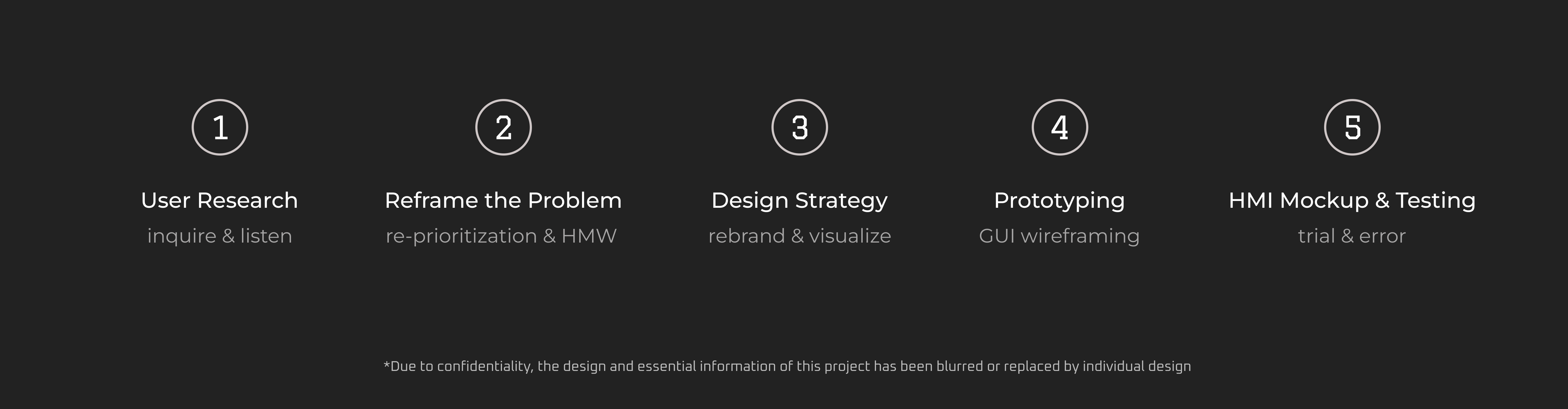
The journey from strategy to HMI design encompasses concept ideation, low-fidelity prototyping, user testing, and high-fidelity prototyping.
We started from having an alignment session with PM, tech lead and interior designers. Then I worked on the mockup in low-fi prototype, and iterated according to usability testing with 6 participants before handing off to the engineers. Due to the confidentiality regulations, the design details could not be shared and only process of design could be displayed.
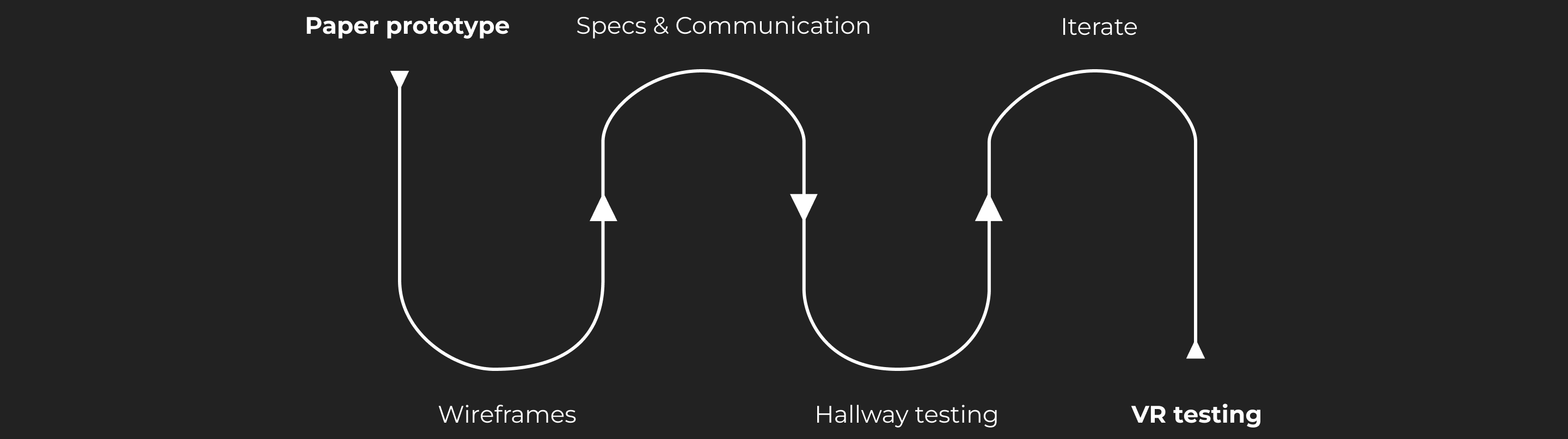

By wifeframing the initial interface, we can easily test the efficacy of different layouts, information structures and interaction.
Due to NDA restrictions, the high-fidelity prototype could not be displayed. If you are interested and want to know details about the design, please reach out to me over email: 1600018113wjn@gmail.com.